Here is my final Digipak, I feel it is successful because the colour is eye-catching. The logo also stands out and will become recognisable. I decided to use images of the front of the house, inside, and outside as a representation of the audience being invited in to Tonic's imaginary world, full of creativity, experiments and uniqueness. The drawing of the band was influenced by The Beatles poster which used a similar technique. I decided not to use a real image of them because the bands focus is on their passion for music not their appearance or fame. I added social media sites on the back cover as this fits in with the primary target audience consisting of teenagers whom would be regular users of these sites. Overall I feel this meets my expectations of creating a fun, experimental and creative design. It also meets the conventions of the Indie genre which I have reinforced by previously researching existing products.
I decided to keep the colour on my poster despite previous feedback, because I feel it represents the fun, creativity aspects of the band. I also used the drawing of the band because I feel this continues the creative theme. It also ties in well and reflects the animated music video. I decided to keep the poster simple by only promoting the album; I feel the colour and logo will attract my audience and form an interest around the band. Overall it reflects the conventions of the Indie genre by representing a creative, fun and experimental band whom are focused on their music.
I have changed my panels on my Digipak as I had previously put them in the wrong position. The front cover involves the bands logo to make them recognisable, I also used coloured waves to present the name of the album 'Colour spectrum', and feel this works well as it is bright and white background helps the colour to stand out. I also reflected this on the back panel to create a continuity through the Digipak. The top three panels involve the front of the house, this is where I placed the track list - I feel I may need to improve the composition of the track list as I don't feel the typography is easy to understand. The disc then represents the plasiticine band in a house, I feel this works well as the image was taken from the bands debut song 'Bohemian Like You'. I then decided to use images of the musical instruments within the music video because I feel each instrument reflects a band member, this is also emphasised through the logo containing silhouettes of the instruments. The panel involving the band reflects them through the same drawing which was used on the poster; the reason i decided to not use a photo of the real band is because Tonic are not creating music to become famous, they are doing it because they enjoy it and they feel their image is less important than the music. Therefore I have only used a short live performance from them in the music video. I also feel I need to change the composition of the spine because the logo has not been positioned in the centre.
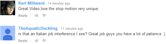
Once we had uploaded the video to YouTube we received several comments from people, they were all very positive and presents how our time and effort was worth it. I feel our final music video turned out better than I predicted because I felt we would get bored and impatient with the slow process of stop motion.
Here we have finally completed our music video, I really like the use of the live performance because it means the stop motion doesn't get boring or predictable; it also helps the narrative come together and makes it easy to understand for our audience. I feel our video is successful and the time and effort put into creating the stop motion was worth it.