Making digipak draft
Here I have begun experimenting with the colour scheme, however I decided not to continue with this idea because I feel the pastel colours are to feminine and will not appeal to my target audience. The coloured waves also need improving as I found it difficult to get the shape I wanted on Photoshop. But this experiment has made me realise the effect the coloured waves would give and I feel it would be a good representation of the bands creativity.
To improve on the waved shaped I decided to physically make them out of coloured card to get the form I desired, I then edited the colours on Photoshop. I feel this will give a more sophisticated outcome because the outline will be straight and consistent.
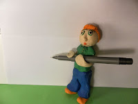
I have also taken knew photos for my digipak and will be experimenting with them, I want the model holding the pen to appear as if he is writing the track listing and the other one to be advertising the competition.
 Here I have experimented with the coloured waves, I added a blur effect so the colour didn't appear to overpowering and distracting the audience from the other elements. I decided to write the track listing myself as I wanted the affect of the band writing it to represent them being relaxed and not wanting everything to be perfect; I also feel it will make the audience feel closer to Tonic - as if they are writing to their fans; making the digipak feel personal to each buyer. I will need to develop this idea to involve all 4 band members because at the moment I feel it only represents 2. I will also need to consider the disc design.


No comments:
Post a Comment